The default Dashboard is immediately displayed
after you successfully log in to your RUCKUS One account and also when you
select the Dashboard menu option. It
provides a snapshot of the information most important to you, displayed as interactive
data
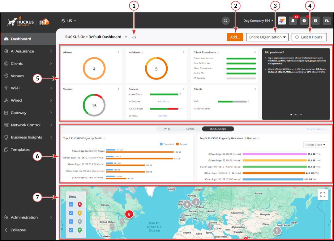
widgets and report widgets. The describes the
organization and functions provided on the default Dashboard.
Dashboard: A Snapshot of Your
Networks
Default Dashboard Elements
Number
Element
Description
1
Click the icon to access your My Dashboards
sidebar, where you can import your customized dashboard canvases and
select them for display.
2
Click Add... to add a Venue, Wi-Fi
network, or a Device (Wi-Fi AP, Switch, or RUCKUS Edge).
3
The venues filter allows you to control the scope of data
displayed on the Dashboard. The default setting is Entire
Organization, meaning information for all of your
Venues is displayed. The drop-down menu allows you to select one or more
specific Venues to see only their information.
4
The time/date
filter allows you to control the period for which data is
displayed.
Click the button to select from predefined options:
Last 8 Hours
(the default setting), Last 24 Hours, Last 7 Days, and
Last 30 Days,
or select a custom period within the last 30 days using the calendar
widget.
5
Informational widgets
The top portion of the Dashboard's content
area is organized into individual tiles (or widgets) displaying the
following information and providing quick access to additional
details when you click the icon:
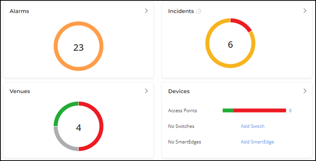
Alarms:
Displays the total number of active alarms and displays an
interactive pie chart ring color-coded by alarm severity.
Click the
icon to display details for all
new alarms and cleared alarms, as well as clear all alarms
with a single click.
Incidents: Displays the total number of incidents and
displays an interactive pie chart ring color-coded by incident
severity.
Click the icon to go to the Incidents page to view details of each
incident.
Client
Experience: Displays the following KPI metrics:
Connection Success
Time
To Connect
Client Throughput
Online APs
AP
Capacity
Click the
icon to go to the Network Assurance > Health page, where you can access additional data
and KPIs.
Venues:
Displays the total number of existing Venues and displays an
interactive pie chart ring color-coded by Venue status.
Click
the icon to go to the Venues page
to view details for each venue.
Devices: Displays the total number of each type of
supported device and displays an interactive bar graph
color-coded by device status.
Click the icon to go to the
Wi-Fi > Access Points page.
When there are no devices of a specific type, an Add
option is provided.
When there are one or more devices of a specific type,
click the number at the end of the bar graph to go to
the applicable GUI page to view device details.
Clients: Displays the total number of Wi-Fi clients, AP
Wired clients, and Switch Wired clients and displays an
interactive bar graph color-coded by client status.
Click the icon to go to the Wireless Clients page.
When there are one or more clients of a specific type,
click the number at the end of the bar graph to go to
applicable GUI page to view device details.
Did you know?: Displays quick insights curated by the
system based on the previous week's data.
Top venues with the highest number of incidents
Top applications in terms of users
Busiest WLAN in terms of users, including its percentage
of the total users
Average daily airtime utilization per radio band,
including the percentage of change from the week
prior
L3 authentication failure trends
The insights pages rotate periodically or may be user
selected. The insights are impacted by the Venue filter, but not
impacted by the time/date filter.
6
Report widgets
The reports section has the following tabs of
interactive report widgets:
Wi-Fi: When selected, displays Wi-Fi (AP)-related
reports.
Switch: When selected, displays switch-related
reports.
RUCKUS Edge: When selected, displays RUCKUS Edge-related
reports.
Click See more reports to go the Reports
page.
7
Map
Displays location markers within the Google
map. The markers are color-coded based on Venue status and are
interactive, responding to cursor hover (for brief details in pop-up
form) and cursor click (for immediate access to the Venue's details and
configuration pages).
Note: When a number or the name of an object
managed by RUCKUS One (Venue, AP, Switch, Network, Client) is displayed in blue,
that is
a clickable link to the detail page of the object. For example, the number of APs
in the
Devices widget on the Dashboard links to the AP List page.
Color-Coding of Widgets for Alarms,
Incidents, Venues, and Devices
The color-coded pie charts and bar graphs represent the total numbers of alarms,
incidents, venues, and devices, utilizing colored line segments to denote the
different severities (for alarms and incidents) and status (for venues and
devices).
Segmented Color
Coding
Alarms
Red:
Critical alarms
Dark
Yellow: Major alarms
Incidents
Red: P1
Incidents
Dark
Orange: P2 Incidents
Dark
Yellow: P3 Incidents
Yellow:
P4 Incidents
Venues
Green:
Operational
Gray: In Setup Phase
Red: Requires
attention
Devices
Green: Operational
Red: Require attention
action/Disconnected from Cloud
RUCKUS One supports performing batch
operations (also known as bulk actions) on certain elements and services across your
tenant
account, such as venues, devices, and services.
The RUCKUS One Dashboard presents
network data using snapshot and time range widgets. Knowing the difference helps you
accurately interpret client counts, device numbers, and usage metrics on the
dashboard.


 icon:
icon: