The Incidents
Details page provides a detailed report of the selected incident.
Complete the following steps to view the Incident Details page.
From the navigation bar, select AI
Assurance > AI
Analytics > Incidents. The Incidents page is displayed.
Click on the Severity or
Date attribute of the specific incident. The
Incident Details page is displayed.
Incident Details Page
(Upper Portion Only)
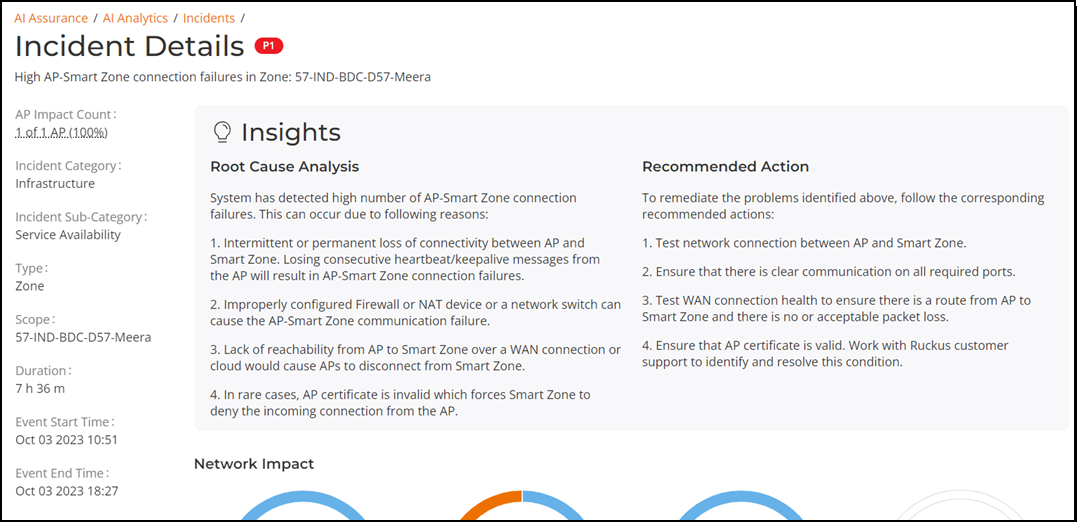
The Incidents Details page
displays the severity level of a selected incident beside the Incidents
Details title and the description of the incident below the
Incidents Details title. The Incidents
Details page has the following components:
Incident Information tile
Insights tile
Network Impact tile
Metrics Graphs
Incident Information Tile
The Incident Information
tile displays the client impact count, AP impact count, incident category, incident
sub-category, type, scope, duration, event start time, and event end time.
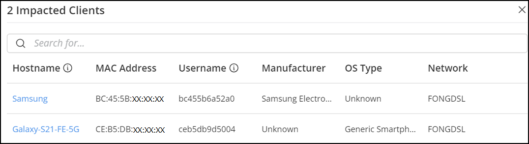
To view the impacted clients, click the value
under Client Impact Count. The Impacted
Client dialog box is displayed. This impacted clients' hostname, MAC
address, username, manufacturer, OS Type, and network are displayed in the table.
You can use the search option to search the required client by MAC address,
manufacturer, or network.
Note: The
hostname is displayed only if the user has successfully obtained an IP address
from DHCP. If not, the MAC address is displayed in the Hostname
column.
Note: The username
is displayed only if the user has successfully passed authentication. If not,
the MAC address is displayed in the Username
column.
Impacted Clients Dialog
Box
To troubleshoot client, click Hostname in the
Impacted Client dialog box. The
Troubleshooting page is displayed. For more information,
refer to Wireless Client Troubleshooting and
Insights.
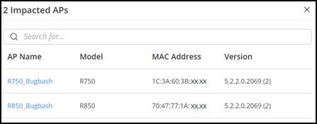
To view the impacted APs, click the value under
AP Impact Count. The Impacted APs
dialog box is displayed. The impacted AP name, model, MAC Address, and version
are
displayed in the table. You can use the search option to search the for a specific
AP by its name, model, or MAC address.
Impacted APs Dialog
Box
To view the affected AP details, click
AP Name in
the Impacted APs dialog box. The AP Details
Report page is displayed. For more information, refer to AP AI Analytics and Insights.
Insights Tile
The Insights tile
comprises Root Cause Analysis and Recommended
Action panes.
Root Cause Analysis Pane
The Root Cause Analysis
pane displays the root cause of the incident. The root cause varies based on the
incident type, impacted area, data events, and reason codes.
Recommended Action Pane
The Recommended Action pane displays the recommended actions to
remediate the problems.
Network Impact Tile
The Network Impact tile
presents various visualizations, including donut charts, time-series graphs, switch
details, and tables listing the impacted areas of the network affected by the
incident. Each incident category and sub-category displays a specific set of network
impact donut charts, with commonly included metrics such as AP models, AP firmware
versions, reasons by AP and event, WLANs, client OS types, radio bands, reason
codes, and event types. These elements help answer key questions such as: Who
is
impacted? Which devices are contributing? What are the reason codes? and more.
Each
donut chart is divided into colored segments and if you pause your cursor over
any
portion of the donut chart, an information box displays, detailed information
about
the impacted area, including the affected clients or APs. Below each chart, a
summary line provides an overview of the impact. The total count of impacted
elements is displayed at the center of each donut chart.
Attributes of the Network Impact Tile
Incident Type
Visualization Elements - Donut Charts/Graphs
Metrics Graphs/Table
User Authentication
Radio: The
distribution of impacted clients connected to 5 GHz and 2.4
GHz radios.
WLAN: The different
WLANs to which the impacted clients are connected.
Client
Manufacturer: The distribution of device manufacturers.
Reason: The
breakdown of various failure reasons experienced by the
impacted clients.
Authentication
Failures: A time-series chart that shows the failure
percentage over time. The chart includes data for 6 hours
before and 6 hours after (if available) the incident.
Clients: A
time-series line chart showing three color-coded client
metrics grouped by: new clients, connected clients, and
impacted clients.
Failures: A
time-series chart with three types of raw failure counts:
Authentication Failures, Authentication Attempts, and Total
Failures, which includes the total of all types of
connection failures (authentication, association, EAP, DHCP,
and so on) that were observed during this period.
EAP
Radio: The
distribution of impacted clients who connected to 5 GHz and
2.4 GHz radios.
WLAN: The different
WLANs to which the impacted clients are connected.
Client Manufacturer: The distribution of
device manufacturers.
Reason: The
breakdown of various failure reasons experienced by the
impacted clients.
EAP Failures: A
time-series chart that shows the failure percentages over
time. The chart includes data for 6 hours before and 6 hours
after (if available) the incident.
Clients: Three
types of time-series data: a line for new clients, a line
for connected clients, and an area chart for impacted
clients.
Failures: A
time-series chart with three types of raw failure counts:
EAP Failures, EAP Attempts, and Total Failures, which
includes the total of all types of connection failures
(authentication, association, EAP, DHCP, and so on) that
were observed during this period.
Association
Radio: The
distribution of impacted clients who connected to 5 GHz and
2.4 GHz radios.
WLAN: The different
WLANs to which the impacted clients are connected.
Client Manufacturer: The distribution of
device manufacturers.
Reason: The
breakdown of various failure reasons experienced by the
impacted clients.
Configuration
Change: Chart with drop-down table displaying configuration
changes that are relevant to the specific incident.
Association
Failures: A time-series chart that shows the failure
percentages over time. The chart includes data for 6 hours
before and 6 hours after (if available) the incident.
Clients: Three
types of time-series data: a line for new clients, a line
for connected clients, and an area chart for impacted
clients.
Failures: A
time-series chart with three types of raw failure counts:
Association Failures, Association Attempts, and Total
Failures, which includes the total of all types of
connection failures (authentication, association, EAP, DHCP,
and so on) that were observed during this period.
DHCP
Radio: The
distribution of impacted clients connected to 5 GHz and 2.4
GHz radios.
WLAN: The different
WLANs to which the impacted clients are connected.
Client Manufacturer: The distribution of
device manufacturers.
Reason: The
breakdown of various failure reasons experienced by the
impacted clients.
DHCP Failures: A
time-series chart that shows the failure percentages over
time. The chart includes data for 6 hours before and 6 hours
after (if available) the incident.
Clients: Three
types of time-series data: a line for new clients, a line
for connected clients, and an area chart for impacted
clients.
Failures: A
time-series chart with three types of raw failure counts:
DHCP Failures, DHCP Attempts, and Total Failures, which
includes the total of all types of connection failures
(authentication, association, EAP, DHCP, and so on) that
were observed during this period.
RADIUS
Radio: The
distribution of impacted clients who connected to 5 GHz and
2.4 GHz radios.
WLAN: The different
WLANs to which the impacted clients are connected.
Client Manufacturer: The distribution of
device manufacturers.
Reason: The
breakdown of various failure reasons experienced by the
impacted clients.
Configuration
Change: chart with drop-down table displaying configuration
changes that are relevant to the specific incident.
Radius Failures: A
time-series chart that shows the failure percentages over
time. The chart includes data for 6 hours before and 6 hours
after (if available) the incident.
Clients: Three
types of time-series data: a line for new clients, a line
for connected clients, and an area chart for impacted
clients.
Failures: A
time-series chart with three types of raw failure counts:
RADIUS Failures, RADIUS Attempts, and Total Failures, which
includes the total of all types of connection failures
(authentication, association, EAP, DHCP, and so on.) that
were observed during this period.
Time to Connect
Radio: The
distribution of impacted clients who connected to 5 GHz and
2.4 GHz radios.
WLAN: The different
WLANs to which the impacted clients are connected.
Client Manufacturer: The distribution of
device manufacturers.
Reason: The
breakdown of various failure reasons experienced by the
impacted clients.
Configuration
Change: Chart with drop-down table displaying configuration
changes that are relevant to the specific incident.
Time to Connect
Failures: A time-series chart that shows the failure
percentages over time. The chart includes data for 6 hours
before and 6 hours after (if available) the incident.
Clients: Three
types of time-series data: a line for new clients, a line
for connected clients, and an area chart for impacted
clients.
Time to Connect (By stage): A
time-series chart that displays the time to connect based on
various stages of the connection such as authentication,
association, EAP, Radius, and DHCP. Pause your cursor over
the graph for more information.
RSSI
WLAN: The different
WLANs to which the impacted clients are connected.
OS: The
operating systems impacted by the incident.
AP Model: The
AP model impacted by the incident.
AP Version:
The AP version impacted by the incident.
Radio: The
distribution of impacted clients who connected to 5 GHz and
2.4 GHz radios
RSSI Quality by
Clients: Three types of time-series data: a line for new
clients, a line for connected clients, and an area chart for
impacted clients.
RSSI Distribution:
The RSSI distribution over a period of time.
Network Latency
Ping Latency:
Average time, in milliseconds, for the controller nodes to
transmit and receive the packets. Maximum, average, and
minimum latency trends are plotted on the graph.
Controller-1: CPU,
memory and input-output usage of the controller node over
time is displayed.
Controller-2: CPU,
memory and input-output usage of the other controller node
over time is displayed.
Reboot
AP Model:
Distribution of impacted AP models.
AP Firmware:
Distribution of impacted AP versions.
Reason by AP:
Distribution of reasons for failure that caused the AP
reboot.
Reason by
Event: Distribution of reasons for failure that caused the
AP reboot and triggered related events.
Reboot by
System: A time-series chart that displays the number reboot
events.
Connected
Clients: A time-series chart that displays the number of
clients connected at that point in time.
Rebooted APs:
A time-series chart that displays the number of APs that
were rebooted at a point in time.
SmartZone CPU overload insight
SZ
Applications: Distribution of CPU usage by individual
SmartZone applications.
SZ
Applications Group: Distribution of CPU usage by individual
SmartZone application groups.
Normalized
CPU Usage: A time-series chart that displays the CPU usage
in percentage.
Memory and
I/O Usage: A time-series chart that displays the memory and
I/O usage in percentage. You can select the check-box to
displays only one or both of the usage metrics.
CPU Usage by
Application Groups: A time-series chart that displays the
CPU usage in percentage, for the various SmartZone
application groups. You can select the check-box to displays
only one or more of the usage metrics.
High AP-controller connection failures
AP Model:
Displays the percentage of failure that impacted various AP
models
AP Firmware:
Displays the number of failures that impacted various AP
firmware versions
Event Type:
Displays the percentage of failures that were caused by
various events
Reason: Lists
the reasons that caused the incident
AP-Controller
Disconnections: A time-series chart that displays the number
of disconnections between the AP and controller over
time.
Event Count: A time-series chart that
displays the total event count for the following events:
Heartbeat Lost, Connection Lost, Reboot By System, and
Reboot By User. When an event is generated for the above
mentioned conditions, it is plotted in this graph. You can
select the checkbox to displays only one or more of the
events.
Channel Distribution
AP
Distribution by Channel: Heatmap that displays the AP count
over time, across channels.
Rogue
Distribution by Channel: A time-series chart that displays
the number of rogue APs across channels.
VLAN Mismatch
Impacted switches: Displays the number
of switches impacted by VLAN mismatch
Mismatched VLAN: Displays the number of
VLANs that are mismatched
Incident
identifies incorrect VLAN configurations between switches and
wired devices due to which data transmission could be impaired.
Impacted Switches table: Displays
detailed information about the switch name, MAC address,
mismatched VLANs, mismatched ports, and mismatched device
information where the VLAN mismatch occurred.
Mismatched VLAN numbers are highlighted red.
Memory Utilization
Incident identifies memory leaks within the switch. The time-series
chart displays high memory utilization by a switch against the
threshold set. Pause your cursor over the graph to determine the
switch memory used against the threshold set, at a time.
The Detected
Time identifies when the memory leak happened and based
on the threshold set, a Projected
Time is calculated and plotted on the graph. Projected
time is predicted; it is the time by when the switch will run
out of available memory. Contact RUCKUS Support for
assistance.
You can select the checkbox to displays only Memory Used
or Threshold
graphs.
PoE Power
Impacted
Switch: Displays the number of switches impacted by the
denial of PoE power
Impacted PoE
Port: Displays the number of PoE ports that are impacted by
the denial of PoE power.
The Impacted
Switches table displays detailed information about the
switch (name, MAC address, port) for which PoE power was
denied.
AP PoE Underpowered
AP Model:
Displays the percentage of failure due to insufficient PoE
power that impacted an AP model
AP Firmware:
Displays the percentage of failure due to insufficient PoE
power that impacted an AP firmware version
AP POE
impact: Displays the number of APs impacted at a time, due
to insufficient power available on the PoE port
Impacted AP:
Displays the list of APs impacted by failure due to
insufficient PoE power within the network
AP Ethernet Auto-negotiation
AP Model: Displays the distribution of
AP models affected by physical link speed or duplex mismatch
between the AP and the upstream device. Pause your cursor
over the sliced segments of the donut chart to view the
count of impacted APs for each model. The summary line below
the chart indicates the total number of AP models impacted
by the incident.
AP Firmware: Displays the distribution
of AP firmware versions affected by the incident. Pause your
cursor over the sliced segments of the donut chart to view
the count of impacted APs for each firmware version. The
summary line below the chart indicates the number of AP
firmware versions impacted by the incident.
Impacted APs: Displays a time-series
graph to indicate the number of APs impacted by the
incident over time.
Impacted AP Details: Displays the list
of APs impacted by the incident in a table format. The table
includes the following columns:
AP Name: The name of the impacted AP.
MAC Address: The MAC address of the impacted
AP.
AP Group: The group to which the AP belongs.
Interface: The specific network interface on the
AP that experienced the incident.
AP Port Capability: The maximum supported
physical link speed and duplex mode for the AP’s
Ethernet port
Upstream Port Capability: The maximum supported
physical link speed and duplex mode for the port
on the upstream device connected to the AP
Event Time: The time at which the incident
occurred.
SZ Cluster
WLAN: The
different WLANs to which the impacted clients are connected.
Reason: The
breakdown of various failure reasons experienced by the
impacted clients.
Client
Manufacturer: The distribution of device manufacturers.
Radio: The
distribution of impacted clients connected to 5 GHz and 2.4
GHz radios.
Time Incidents: a time-series chart that shows
when the controller cluster sends data with an incorrect timestamp.
Airtime Busy
Average Airtime Busy: Displays the
average percentage of airtime busy and peak percentage of
airtime busy. Pause your cursor over the sliced segments of
the donut chart to view average airtime Rx, Tx, Idle, and
Busy over the incident period.
Rogue APs: Rogue APs: Displays the
distribution of rogue APs across channels. It also displays
the channel with the highest number of rogue APs. Pause your
cursor over the sliced segments of the donut chart to view
the number of rogue APs in each channel. If the donut chart
is empty, you may need to enable Rogue AP detection in the
zone.
Rx PHY
Errors: Displays the distribution of PHY errors across
impacted APs over the incident period.
AP Model:
Displays the distribution of impacted AP models.
Airtime Utilization for the specified radio band: Displays a
time-series graph to indicate average airtime utilization for the
respective radio band (2.4 GHz, 5 GHz, or 6 GHz) over the incident
period. The data is aggregated over impacted APs only. Pause your
cursor at any instance on the timeline graph to view the airtime
utilization details at a specific date and time during the
incident.
Airtime Tx
Average Airtime Tx: Displays the average
time and peak time spent by the radio in sending the data.
Pause your cursor over the sliced segments of the donut
chart to view average airtime Rx, Tx, Idle, and Busy values
over the incident period.
Average % of
Mgmnt. frames: Displays the distribution of data frames as
against management frames over the incident period.
Average % of
MC/BC traffic: Displays the distribution of Unicast traffic,
Multicast traffic, and Broadcast traffic over the incident
period.
Average Peak No. of Clients per AP:
Displays the number of clients per AP. Pause your cursor
over the sliced segments of the donut chart to view the
number of APs in each.
Less
than 30 APs over the incident period.
31
through 50 APs over the incident period.
More
than 50 APs over the incident period.
Airtime Utilization for the specified radio band: Displays a
time-series graph to indicate average airtime utilization for the
respective radio band (2.4 GHz, 5 GHz, or 6 GHz) over the incident
period. The data is aggregated over impacted APs only. Pause your
cursor at any instance on the timeline graph to view the airtime
utilization details at a specific date and time during the incident
period.
Airtime Rx
Average Airtime Rx: Displays the average
and peak time spent by the radio in receiving the data.
Pause your cursor over the sliced segments of the donut
chart to view average airtime Rx, Tx, Idle, and Busy values
over the incident period.
Average Peak No. of Clients per AP:
Displays the number of APs in each bin. Pause your cursor
over the sliced segments of the donut chart to view the
number of APs in each bin.
Less
than 30 APs over the incident period.
31
through 50 APs over the incident period.
More
than 50 APs over the incident period.
AP Model:
Displays the distribution of impacted AP models.
Airtime Utilization for the specified radio band: Displays a
time-series graph to indicate average airtime utilization for the
respective radio band (2.4 GHz, 5 GHz, or 6 GHz) over the incident
period. The data is aggregated over impacted APs only. Pause your
cursor at any instance on the timeline graph to view the airtime
utilization details at a specific date and time during the
incident.
TCP-SYN DDoS
The
recommended action to remediate the issue is to configure the
TCP SYN DDoS protection threshold on the affected port to a
value less than 1000 or adjust it based on the deployment
requirements.
Switch Distribution: Displays the
distribution of switches by DDoS attack detection status.
Pause your cursor over the sliced segments of the donut
chart to view the count of impacted and non-impacted
switches. The total number of switches is shown at the
center of the chart, with a summary line below providing an
impact overview.
Impacted Port Count: Displays a time-series graph tracking
the detection of TCP-SYN flood attacks on switch ports over
time. The X-axis represents the time period, while the
Y-axis shows the number of impacted switch ports.
Impacted Switches: Provides detailed information, in a table format,
about switches affected by TCP-SYN flood attacks. The table includes
the following columns:
Switch Name:
The name of the impacted switch.
Switch MAC:
The MAC address of the impacted switch.
Switch
Serial: The serial number of the impacted switch.
Port Numbers:
Lists the ports affected by the attack.
Action:
Includes an option to copy the affected port numbers to the
clipboard for quick reference.
Port Congestion
Note: This incident requires switches to run FastIron firmware
version 10.0.10f or later as a prerequisite.
Details: Displays switch-specific information, including the
name, model, MAC address, and firmware version of the switch
where port congestion has been detected.
Impacted Port Count: Displays a
time-series graph tracking port congestion detected in the
switch over time. The X-axis represents the time period,
while the Y-axis shows the number of congested ports.
Note: A LAG (Link Aggregation Group) is considered as a single port,
regardless of the number of member ports it contains. If the LAG
name is modified, a new row is added to the same incident,
provided congestion is detected on the renamed LAG.
Note: Stacking ports are excluded from
congestion detection and are not considered when generating
incidents.
Impacted Ports: Displays detailed information, in a table format, about
ports where congestion has been detected, including port and peer
device details.
Port
Number/LAG: The switch port or Link Aggregation Group (LAG)
on the switch where congestion is detected.
Peer Device:
The peer device connected to the congested port or LAG.
Uplink Port Congestion
Note: This incident
requires switches to run FastIron firmware version 10.0.10f or
later as a prerequisite.
Details - Impacted switch: Displays the
total number of impacted switches in the switch group.
Details - Impacted uplink ports:
Displays the total number of impacted uplink ports in the
switch group.
Congested Port Count: Displays a time-series graph tracking
uplink port congestion detected in the switch group over
time. The X-axis represents the time period, while the
Y-axis shows the number of congested uplink
connections.
Note: A LAG (Link Aggregation Group) is considered as a single port,
regardless of the number of member ports it contains. If the LAG
name is modified, a new row is added to the same incident,
provided congestion is detected on the renamed LAG.
Impacted Switches: Provides detailed information
about switches where uplink port congestion has been detected,
including switch and peer device details.
Switch Name: The name of the impacted switch.
Switch MAC: The MAC address of the impacted switch.
Switch Port/LAG: The switch port or Link
Aggregation Group (LAG) on the switch where congestion is
detected.
Peer Port: The port on the peer device connected to the
congested switch port or LAG.
Peer Device: The peer device connected to the impacted
switch.
Peer Device MAC: The MAC address of the peer device
connected to the impacted switch.
Loop Detection
Note: This
incident requires switches to run FastIron firmware version
10.0.10f_cd2 or later as a prerequisite.
Switch Distribution: Displays the
distribution of switches by L2 loop detection status. Pause
your cursor over the sliced segments of the donut chart to
view the count of impacted and non-impacted switches. The
total switch count is shown at the center of the chart, with
an impact summary displayed below the chart.
Impacted Switch Models: Displays the
distribution of impacted switches by model. The center of
the chart indicates the total number of impacted switch
models, and a summary line below highlights the most
affected model.
Impacted Switch Firmware: Displays the distribution of
impacted switches by firmware version. The center displays
the total number of impacted firmware instances, with a
summary below indicating the most affected version.
VLANs: Displays the VLANs where L2 loops have been
detected, including information about affected switches and VLAN
IDs. The table includes the following columns:
VLAN ID: Displays the VLAN where L2 loop was detected.
Clicking the VLAN ID opens a sidebar with detailed
information of the impacted switches within the
VLAN.
Switch Name: The name of the switch where the loop
was detected.
MAC Address: The MAC address of the impacted
switch.
Serial Number: The serial number of the impacted
switch.
Switches: Displays the switches on which the loop was
detected within the specified VLAN.
LLDP Status
Note: This
incident requires switches to run FastIron firmware version
10.0.10g or later as a prerequisite.
Switch Distribution: Displays the
distribution of switches by LLDP running status. This chart
helps identify the switches that are affected by LLDP being
disabled or misconfigured, potentially resulting in reduced
network visibility and incomplete topology mapping for AI
analysis. Pause your cursor over the sliced segments of the
donut chart to view the count of impacted and non-impacted
switches. The total switch count is shown at the center of
the chart, with an impact summary displayed below the
chart.
Impacted Switch Models: Displays the
distribution of the specific switch models on which LLDP is
disabled or not fully operational. Pause your cursor over
the sliced segments of the donut chart to view the count of
impacted switches per model. The center of the chart
indicates the total number of impacted switch models, and a
summary line below highlights the most affected model.
Impacted Switch Firmware: Displays the
distribution of impacted firmware versions on switches where
LLDP is disabled or misconfigured. Pause your cursor over
the sliced segments of the donut chart to view the count of
impacted firmware versions. The center displays the total
number of impacted firmware instances, with a summary below
indicating the most affected version.
Impacted Switches: Provides detailed information
about switches impacted by LLDP being disabled or misconfigured.
Switch Name: The name of the impacted switch where LLDP is
not fully operational.
Switch Serial: The serial number of the impacted switch for
identification and support tracking.
Switch MAC: The MAC address of the impacted switch.
Impacted Reason: Describes the LLDP configuration issue
detected on the switch, such as global LLDP disablement,
port-level disablement, unidirectional operation
(transmit-only or receive-only), and so on.
Port Details: The affected ports where LLDP is disabled or
misconfigured, providing visibility into specific interfaces
missing neighbor discovery data.
Port Flap
Note: This
incident requires switches to run FastIron firmware version
10.0.10g or later as a prerequisite.
Switch Details: Provides detailed
information about the switch on which one or more ports have
experienced port flapping.
Switch Name: The name of the switch where port
flapping was detected.
Switch Model: The hardware model identifier of the
switch.
Switch MAC: The MAC address of the switch.
Switch Firmware Version: The firmware version
currently running on the switch.
Number of Ports: The total number of ports
available on the switch.
Ports
with Flap: The number of ports on the switch that
have experienced port flapping.
Impacted Port Count: Displays a time-series graph tracking
port flaps detected on the switch over time. The X-axis
represents the time period, while the Y-axis shows the
number of ports that experienced flapping.
Impacted Ports: Provides detailed information, in a table format, about
each port on the switch that experienced flapping. It helps you
pinpoint exactly which interfaces were unstable and offers
visibility into their configuration, and connected devices.
An actionable
message is also displayed under the Impacted Ports section.
Clicking the switch name redirects you to the Reports
tab of the Switch List page for a deeper
analysis of the affected switch.
You can export
the Impacted Ports table in the CSV format by clicking the
icon.
The table includes the
following columns:
Port ID: The
unique identifier of the port that experienced
flapping.
Port Type:
Indicates the physical medium of the port, such as fiber or
copper.
VLAN: The
VLANs associated with the port.
PoE Detail:
The Power over Ethernet (PoE) operational state of the
port.
Remote Device
Type: The type of remote device connected to the port.
Remote Device
Port: The port identifier of the remote device.
Remote Device
Name: The system name of the connected remote device. If the
device is managed by RUCKUS One or SmartZone, the name is
displayed as a hyperlink that redirects to the
Reports page for the device.
Last Flap
Time Stamp: The most recent timestamp when flapping was
detected on the port.
Metrics Graphs
At the bottom of the page are various graphs representing the related metrics and
impacted network areas for the time before, during, and after the incident. These
data, used in conjunction with Insights, are intended to assist in troubleshooting
and remediation. For descriptions of the various graphs, refer to attributes in
Attributes of the Network Impact Tile .
 icon.